An increase in ADA and AODA-related lawsuits has put the spotlight on accessibility in recent years.
Accessibility is an important consideration for all businesses and website owners. However, the lines between accessibility and usability are often blurred.
Let’s look at some of the key differences between accessibility vs. usability to ensure you know how to provide a better online experience to all users and steer clear of costly lawsuits.

Accessibility is linked to acts such as the Americans with Disabilities Act (ADA), Section 508, and the Accessibility for Ontarians with Disabilities Act (AODA). These acts outline the accommodations that need to be made for people living with disabilities.
Web accessibility is an essential part of the requirements that businesses need to meet to comply with these laws.
The Web Content Accessibility Guidelines (WCAG) are the driving force behind these requirements. They cover the technical aspects of accessibility, ensuring users with visual, hearing, mobility, and cognitive impairments are able to access and engage with a site.
Catering to different disabilities also means ensuring your site is compatible with a variety of assistive technologies, including screen readers.
When it comes to usability, it’s more about focusing on someone’s experience on your website. It’s about ensuring someone can find what they need and complete their desired task with ease. This could be anything from downloading an eBook to making a purchase or completing a form.
The primary goal of usability is to make sure an existing or potential customer is satisfied with their experience on your site.
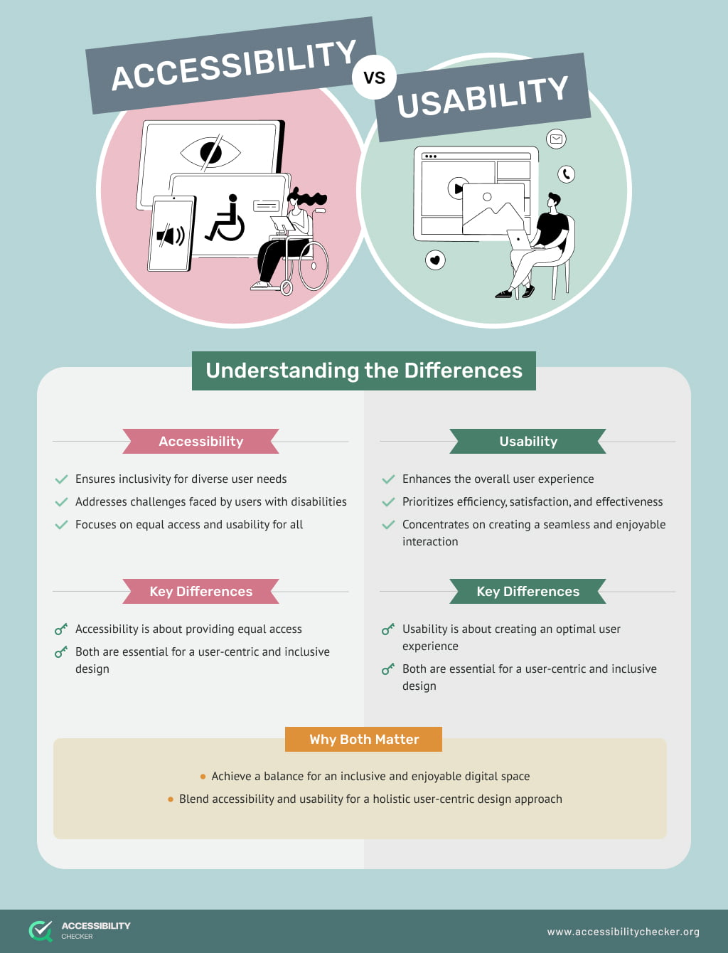
Where accessibility mainly focuses on users with disabilities and impairments, usability caters to the needs of all website visitors.
This is where the overlap between accessibility and usability comes in. The steps you take to improve the usability of your site will benefit all users at the end of the day, including your disabled visitors.
It can be difficult to spot major differences between usability and accessibility, but there are some.
By fixing usability issues, it generally creates a positive experience for all site visitors. However, there may be times when focusing on accessibility issues can create usability problems. This is where thorough testing and adhering to WCAG best practices become incredibly important.
For example, adding alternative text to an image is in line with WCAG requirements. But, if the text is too complicated or too long, it can create a poor user experience.
The other major difference between accessibility vs. usability is that accessibility has a stronger focus on the technical aspects of a site. Developers would spend more time on the code when making a site accessible. In the case of usability, designers and UX professionals would also look at the visual elements of a site.
In the end, web accessibility should be viewed as an integral part of the UX process. The goal is to create a better experience for all users, including those living with disabilities.
The process of testing your site’s accessibility vs. usability will be slightly different.
Testing for accessibility will require you to evaluate the code of your site in relation to WCAG guidelines.
Automatic testing tools such as AccessibiltyChecker are available, which makes this process a lot easier. However, it’s always best to pair automated testing with manual testing to ensure nothing is missed and that you’re 100 percent compliant.
It’s also highly recommended that you test your site using assistive technologies to gauge the overall user experience.
Once you are compliant, don’t forget to generate an accessibility statement for your site, which will outline the steps you have taken to cater to the disabled community.
Usability testing is a completely manual process that requires human intervention. This can be people within your organization as well as external parties.
Testing your site’s usability means gauging how easy it is to use your site. Can people perform different tasks and find the information they need without getting lost or frustrated?
You can also take the time to evaluate the visual elements on your site, including the size of buttons, whether links are visible and easily clickable, and if your fonts are readable.
The final step would be to combine feedback from different users and start working on addressing any issues without impacting your accessibility efforts.
It helps to re-audit your site after making any usability updates to ensure you are still compliant.
Accessibility and usability go hand-in-hand. Your website’s code as well as the visual aspects of your site should provide an engaging experience for all users, regardless of ability.
When testing for accessibility or usability, it really helps to incorporate a human element to achieve the best possible results. When real people spend time using and evaluating your site, you receive real, actionable feedback.
This paired with automated testing tools can ensure your brand is not only compliant but also provides a good first impression, encouraging users to come back to your site.