The web has redefined how we shop, connect, and engage, so it’s become increasingly imperative to ensure that everyone, regardless of ability, can navigate virtual aisles with ease and dignity.
In this blog, we unpack the complexities of accessibility in eCommerce, shedding light on its significance not only from a moral and ethical standpoint but also as a catalyst for driving innovation and growth in the ever-evolving world of online retail.

eCommerce accessibility refers to the process of ensuring all of your customers can enjoy access to your online store, including those with physical and cognitive disabilities.
Where acts such as the Americans with Disabilities Act (ADA) and Section 508 once only applied to physical spaces, today, they also pertain to websites, including eCommerce platforms.
Section 508 states that all electronic and information technology needs to be accessible to users with disabilities. eCommerce store owners are responsible for ensuring every customer has equal access to their websites and products and can navigate the purchasing process with ease.
There are a number of reasons why it’s important to make your online store accessible, starting with the fact that over 42.5 million people (1) in the United States alone are disabled.
Imagine how many potential customers you are chasing away by not providing an equal and accessible online shopping experience.
Making changes to your site in order to meet essential web accessibility guidelines not only results in more sales, but because you’re providing an improved experience, customer loyalty increases too.
Then there’s the fact that accessibility lawsuits are costly and can lead to permanent brand damage, which can ruin your chances of success. According to UsableNet (2), there were over 4,600 web accessibility lawsuits in 2023, with eCommerce websites being some of the prime targets.
Lastly, by complying with the latest web accessibility standards you are automatically providing a better user experience, something search engines such as Google appreciate. When more customers spend time on your site, it can boost your SEO rankings, leading to even more traffic.
Before we get into some of the top tips for how to make your eCommerce website accessible, here are some interesting stats from a report by the Baymard Institute (3).
According to this report, 94% of the 33 eCommerce websites that were included in the study are inaccessible, meaning they do not meet all of the necessary accessibility requirements. This leaves a lot of room for costly brand damage and lost sales.
In terms of the most common areas where these sites fell short, the report found the following:
However, what’s interesting is that even with these issues, over 70% of disabled users would still prefer to shop online, which is an excellent opportunity for eCommerce site owners to make some noticeable improvements.
Now that you know why you should take the time to conform to the latest web accessibility standards, let’s get into a few tips you can apply.
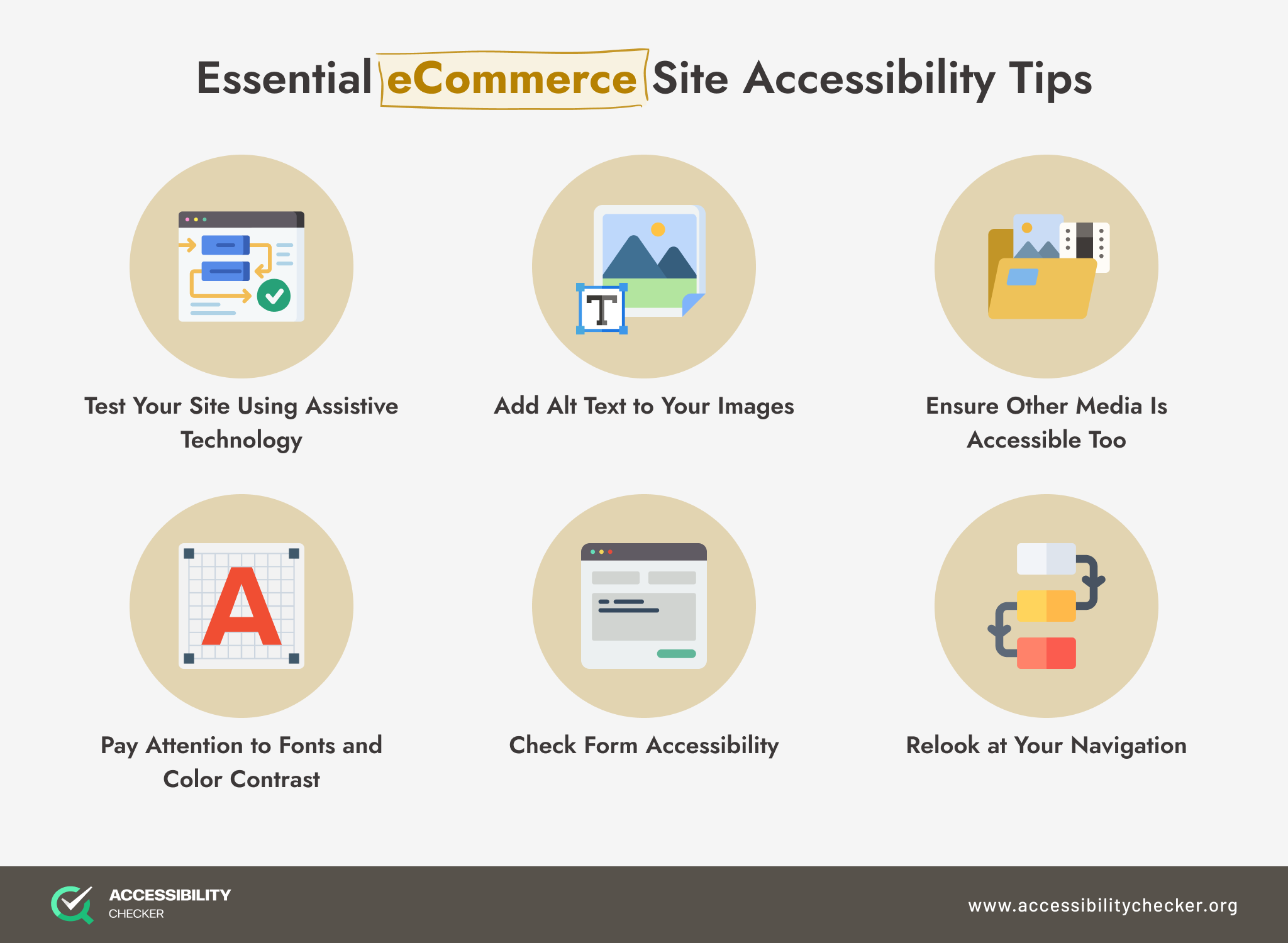
A large percentage of disabled customers will navigate your site using either a screen reader or a keyboard, so it’s essential to make sure your site is compatible with these types of technology. Move through your customer journey using a screen reader or keyboard to determine how easily a disabled user can make a purchase.
Images are an integral part of any eCommerce website, but all users should understand what’s on screen. This is where alternative text comes in.
By adding clear and descriptive alternative text to your images, you ensure that customers who rely on screen readers can understand the images on your site and how they relate to the text. As an added bonus, alt text can improve your SEO rankings.
If you also offer video and audio content on your site, this media needs to be accessible too. Videos should have clear captions that are easy to follow and understand, and any audio clips should have a transcript.
Fonts may seem like a small part of your eCommerce website, but they can also alter the user experience. Fonts should be clear and easy to read – here is a full list of accessible fonts.
As for color contrast, WCAG requires websites to have a ratio of 4:5:1 for regular text and 3:1 for larger text. You can use this free Color Contrast Checker if you are unsure whether your site meets the necessary requirements.
Forms are an element that all customers will encounter during their online shopping journey and are one of the most important elements to consider during the accessibility process.
Forms should be as simple and easy to use as possible. Along with adding clear labels to all fields, you should also provide details on the purpose of the form and the steps required to complete it. Any form errors should be clearly highlighted and explained too.
Your eCommerce website’s navigation is a key part of the customer journey, but is it consistent and logical? Would someone be able to tell exactly where they are on your site at any given time? Is it clear how to find the information they need?
By committing to making accessibility improvements, you have the chance to boost your user experience and be one step ahead of your competitors.
Start by working on your most obvious and critical issues and then endeavor to make ongoing improvements to your online store.
It’s also important to continuously test and improve your site every few months to ensure you’re always compliant with the latest web accessibility standards.