- Categories (3)
- Guides - Platform
- Guides - Reviews
- Technical
Web Accessibility: Driving an Inclusive Online Experience
The guidelines and web standards for accessibility outline design principles that can be used to make it possible for all online users to access your content, products, and services.
Web accessibility is currently enforced by the Web Accessibility Initiative (WIP) of the World Wide Web Consortium (W3C). It’s these organizations that regularly update and publish the Web Content Accessibility Guidelines (WCAG), which we will outline later on.
A 2023 report by the World Health Organization (1) states that 16% of the global population is living with some form of disability, which includes cognitive, neurological, and physical disabilities.
What’s more, disability rates are set to increase as the population ages and the likelihood of chronic health conditions rises.
Web accessibility is important because it makes the digital arena a more inclusive space for everyone, including the differently-abled community. A sound accessibility strategy also carries business benefits.
Businesses that adopt web accessibility best practices are able to offer their visitors a more memorable and inclusive online experience. And because user experience is at the heart of these best practices, it offers a number of search engine optimization benefits too, making it possible for more of the right people to find your site more often.
Fortunately, technology has made it that much easier to remove online barriers – more on that later.
Key Takeaways
- WCAG defines three levels of accessibility: A (basic), AA (recommended), and AAA (most comprehensive yet challenging to implement).
- Effective web accessibility means ensuring content is Perceivable, Operable, Understandable, and Robus.
- Adding alt text, adjusting color contrast, providing media alternatives, and ensuring keyboard operability are some of the practical compliance steps you can take now.
- Beyond being ethically important, accessible sites deliver a better user experience, broader reach, and SEO advantages.
- While WCAG is the universal standard, compliance is also enforced via laws like the ADA and Section 508 (US), AODA (Canada), EAA (EU), and DDA (Australia).
Understanding the WCAG Compliance Levels
WCAG is currently made up of three levels of compliance: Level A, AA, and AAA.
Level A
This level covers the most basic accessibility requirements for websites and is the minimum level that businesses should aim to achieve. Failure to meet level A requirements means you have a completely inaccessible website.
Level AA
Achieving level AA, means some additional criteria have been met. It addresses more of the common online barriers that the disabled community encounters every day. It’s highly recommended that website owners aim to achieve level AA to meet as many accessibility success criteria as possible.
Level AAA
This is the highest level of accessibility that you can achieve, but it’s also the most difficult because it covers every single aspect of WCAG. And even though this is the most desirable level to achieve, it’s not an absolute necessity.
The Web Accessibility Principles
The WCAG requires website owners to abide by four main principles when making their sites accessible. Referring back to these principles makes it easier to determine whether any changes or updates you are making are in line with WCAG guidelines.

Principle 1: Perceivable
Your website visitors should always be able to understand and perceive the content presented on your site. This includes visitors who are blind or have other visual impairments and rely on technology such as screen readers to consume online content.
Principle 2: Operable
An operable website is one where every part of a site’s functionality can be utilized without disruption to the user. From the most basic functionality such as selecting a link from a menu to any specialized functionality should be operable to all users.
Principle 3: Understandable
Any content on your site, whether it’s written or visual, should be understandable to all visitors. Complex language should be avoided to ensure visitors with cognitive impairments and those who don’t speak your site’s primary language can still engage with all your content. An understandable site is also one that’s organized as intuitively as possible.
Principle 4: Robust
The final principle dictates that your site should be robust, meaning it can be interpreted and consumed by visitors who rely on assistive technology. This means that a site needs to be developed in a way that makes it compatible with a variety of assistive technology.
The 4 Main Components of Web Accessibility
Web accessibility is linked to every component of a website, all of which should be considered to ensure you comply with WCAG guidelines.
Site Content
This includes all of the information that’s housed on your website or app. Examples include text, images, audio, and all code. Basically, site content refers to anything a user would see when visiting your website.
User Agents
User agents refer to desktop and mobile browsers, plugins, media players, and assistive technology – anything a user would need to access your website, app, or content.
Development Tools
Any software, editors, or content management systems that are used to create your website, app, or content also need to be considered during the remediation process.
Evaluation Tools
Lastly, there are the tools that help you test and track your accessibility and remediation efforts.
Basic Web Accessibility Compliance Steps to Take
Here are some of the steps you can take to start making your website more inclusive and compliant with the latest web accessibility standards:
Add alternative text
Any content on your site that isn’t text-related should have alternative text, including images, video, graphs, and audio content. This ensures that visitors with visual impairments are still able to understand and interact with it. For images that are purely decorative and don’t warrant alternative text, you can use a blank alt attribute: <img src=”decorative.jpeg” alt=”” />
Adjust your color contrast
Another way that you can make your site easier to read is by adopting the right color contrast. This makes it easier for users with color blindness to engage with your site. Aim for a 4.5:1 ratio between the foreground color and the background color. You can use this free Color Contrast Checker to determine whether your site meets the necessary requirements.

Offer media alternatives
If you have audio and video files on your site, be sure to add a full transcript to each recording. This way, users who rely on screen readers and text-to-audio technology can access these files.
Structure your site correctly
Structured web pages are easier to consume, so opt for proper headings, bullet points, bolded text, clear links, and simplified menu structures. Structuring your pages in a logical order is also essential.
Implement keyboard compatibility
Many of today’s users navigate the web using only a keyboard, which means your site needs to be compatible with this need. An accessible website is one that is fully functional with a keyboard alone.

Avoid timed content
Users should be able to read or watch content in a time frame that works for them. If any of your content is timed, users should be able to extend the time limit or cancel it.
Avoid flashing content
Because flashing and blinking can trigger seizures in some users, this type of content should be avoided wherever possible. If this is not an option, a warning should always be provided.
Content should be understandable
Before drafting any content for your site, think twice about the language you’re using. Some users may not speak your site’s primary language and others may have cognitive impairments that require simplified sentences. Technical jargon and regional slang should be avoided where possible.
Clean up your HTML
Assistive technologies rely on clean HTML code to correctly relay information to users. For this reason, it’s imperative for your code to be clean and clear. Avoid duplicate IDs and attributes and make sure start and end tags are used consistently.
These are some of the top requirements your site should meet for it to be deemed accessible.
Pro Tip: Build accessibility into your design process from the start. Review color contrast in wireframes, write accessible copy, and involve developers early. It’s easier and cheaper than fixing issues later.
Legislation & Compliance
Even though most of today’s accessibility standards and regulations across the world are based on WCAG, there are some slight differences per country.

Here are the most prominent laws you should be aware of.
ADA – United States
Title III of the Americans with Disabilities Act refers to places of public accommodation, which includes websites. It states that all areas of public accommodation should be accessible to all users. Websites that create barriers to access are considered to be in violation of this law.
Section 508 – United States
Section 508 forms part of the Rehabilitation Act of 1973. It states that all federal agencies in the United States need to make their electronic and information technology accessible to all users, including websites, web applications, software, and electronic documents. Accessibility applies to employees as well as members of the public.
AODA – Canada
The Accessibility for Ontarians with Disabilities Act 2005 (AODA) is applicable to businesses with 50 or more employees operating in or offering products and/or services to people in Ontario. The act requires businesses to identify, remove, and prevent barriers for people with disabilities in order to comply.
EAA – Europe
The European Accessibility Act is an EU initiative that requires EU member states to provide equal access to products and services to all, including those offered online. The EN 301 549 is another European web accessibility standard that covers all information and communications technologies, which means everything from web content to ATMs need to be fully accessible.
DDA – Australia
The Australian Disability Discrimination Act was put in place to protect people living with disabilities. Businesses are required to provide people with equal access to all areas of public life, including online information and services. It also promotes the recognition and acceptance of these individuals within a community.
Web Accessibility Assessment Tools
Now that you have a clearer understanding of what web accessibility entails, you can use these tools to better understand where your website falls in terms of compliance.
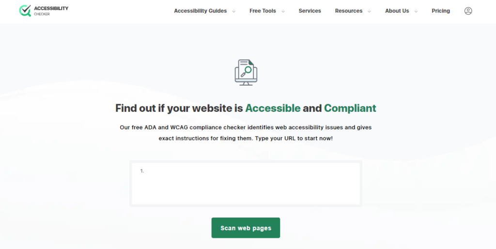
Accessibility Checker
This free tool is not only easy to use but will provide you with a detailed report that outlines the accessibility issues on your site and show you how to fix them, helping you meet WCAG 2.1, level AA requirements. The tool checks your site against both global and local accessibility standards and regulations.
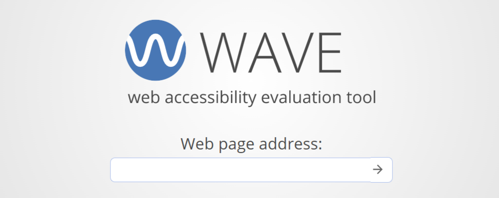
Wave
WebAIM, the creator of Wave, is a non-profit organization with the goal to make the web a more accessible space for all. Simply type in your URL to audit your site or install the browser extension, which allows you to check any site as you browse. And for businesses that want to automate web accessibility checks, the Wave API is available as a paid application.
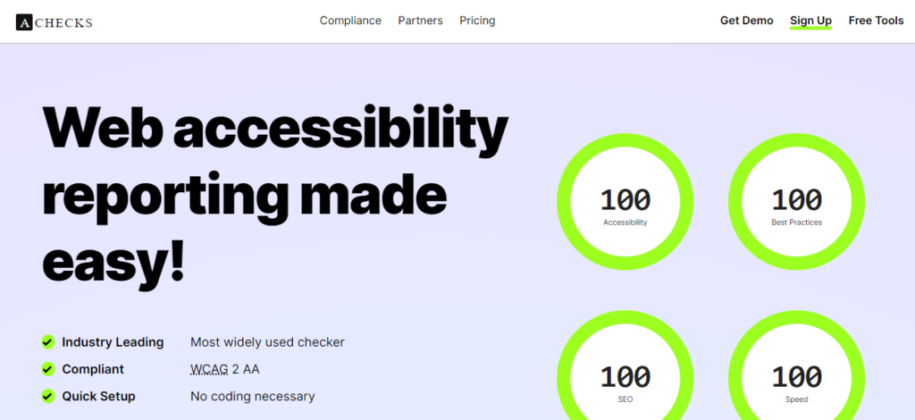
AChecks
For businesses looking to comply with WCAG 2.1 at level AA, AChecks is another good tool to use. AChecks makes it possible to monitor your site for any accessibility issues related to ADA and AODA compliance. The detailed reports outline what needs to be fixed on your site and the dashboard even gives you access to web analytics to track performance once changes are made.
Pro Tip: Don’t forget to test accessibility on mobile devices too. Ensure tap targets are large enough, forms are easy to complete on small screens, and all interactive elements are labeled for screen readers.
5 Good Examples of Accessible Websites
Let’s look at a few websites that get it right in terms of accessibility that you can use as a reference.
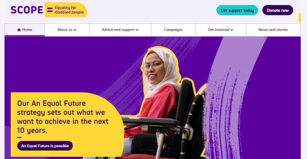
Scope
Based in England and Wales, this charity website is an excellent example of accessibility done right. The copy is clear and to the point, color contrast ratios have been met, and the site is fully compatible with assistive technology. An accessibility panel is also available on the site to allow users to customize their experience.
1% for the Planet
This is another charity organization that values the importance of web accessibility. The site’s layout is simple, clean, and responsive, and its animated header can be paused. They’ve also used high-contrasting text, ARIA tags, and have used HTML correctly to structure each page.

BBC iPlayer
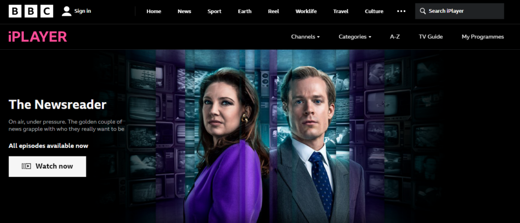
Along with being a popular streaming service, BBC iPlayer is a site that other businesses can learn from when it comes to accessibility. The website is compatible with assistive technology, easy to navigate, and the layout is well thought out. They have even gone as far as adding an accessibility help option to their logo, ensuring disabled users can find answers to questions.
Girls Who Code
This non-profit organization helps women and girls pursue careers in technology, including those in the disabled community. This particular site is uncluttered and is built with clean, simple code to ensure it’s compatible with assistive technology. And because there are very few visual effects, it’s one of the easiest sites for anyone to navigate.
NSW Government
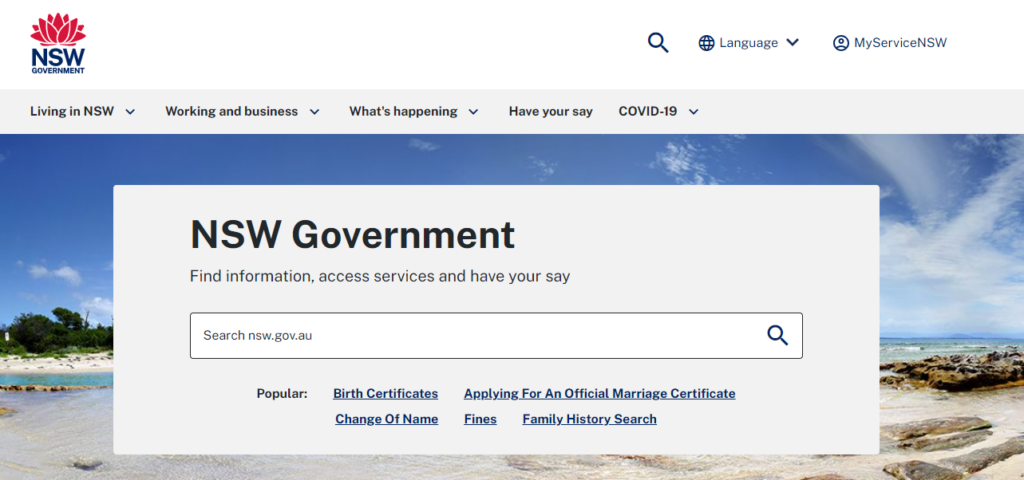
The New South Wales government has ensured that its website is accessible to all through a clean, simple, and accessible design. Tab navigation makes the site keyboard compatible and large fonts and contrasting colors make it very readable. It’s also compatible with other forms of assistive technology.
5 Examples of Inaccessible Websites
We also thought it helpful to include some examples of websites that don’t meet the necessary web accessibility standards so that you know what not to do.
CBS Miami
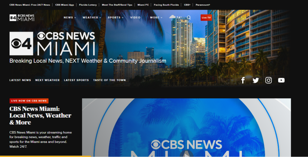
Even though CBS Miami is a leading news website, it’s not fully compliant with all WCAG guidelines. For one, there are little to no alt tags on their images, which is surprising considering how many visuals they use. The site also isn’t entirely keyboard-friendly, which alienates a number of disabled users who rely on keyboards to navigate the web.
L’Oréal
The L’Oréal group website is another example of a site that isn’t fully compliant with a number of important web accessibility laws. Even though they state that they are compliant with article 47 of the French law n°2005-102 of February 11th 2005, there are still some accessibility gaps. For one, not all of their script is compatible with assistive technology. Some website components also can’t be controlled by users with disabilities. Color contrast and heading elements are other areas where they fall short.

Air Choice One
Air Choice One is a leading regional airline in America. Unfortunately, blind users would have a difficult time navigating the website. There is no indication of which elements on the site are keyboard navigable, which means certain content and functionality is inaccessible to certain users.

ASOS
Disabled users who would like to shop on the ASOS website may have a difficult time doing so as there are a number of accessibility issues. Along with an incorrect color contrast ratio, the ASOS site doesn’t make use of image alt tags. Both of these issues would greatly impact people with blindness and other visual impairments.
PIWNICH
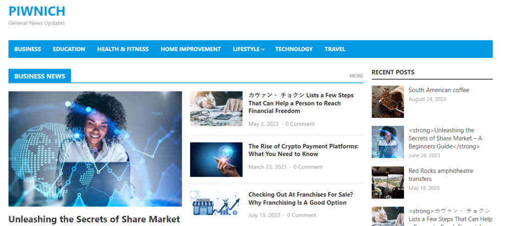
While this news site does have some accessibility features such as the ability to skip content, there are still a few other glaring issues – a poor color contrast ratio being one of them. The other is that the name, value, and role cannot be programmatically determined which means that users who rely on screen readers would not be able to use this site.
What are the four main principles of web accessibility?
Web accessibility is made up of four main principles:
Perceivable. Your site’s content should always be understandable and perceivable, meaning even users who rely on technology such as screen readers must be able to read and engage with your content.
Operable. Every aspect of your website needs to be operable. Whether it’s simply clicking on a link in a menu or interacting with more advanced functionality.
Understandable. All visitors should be able to understand your content. Avoiding any jargon and sticking to clear, simple language is essential.
Robust. Finally, your website should be compatible with a range of assistive technologies to ensure any user can access to engage with it.
What is UX accessibility?
UX accessibility, also known as user experience accessibility, refers to the design processes that are used to create platforms and products that provide a meaningful and relevant experience to all users, including those who are living with physical and cognitive impairments and limitations.
What are the three types of accessibility issues?
Even though there are several types of accessibility issues that a user might encounter, the three main types are:
Visual. These are users who are blind, have partial visual impairments, or are color blind. They rely on technology such as braille keyboards and screen readers to browse the web.
Mobility. Users with motor impairments are not always able to use websites in traditional ways and rely on keyboards, voice recognition, or sip-and-puff devices to navigate the internet.
Auditory. Online users with auditory impairments rely on transcripts and alternative text to understand and engage with content on the web.
What is HTML accessibility?
HTML accessibility refers to coding in a clean and clear way in order for a site to be compatible with assistive technologies. HTML elements should be used for their intended purposes as much as possible, which includes using the necessary start and end tags and avoiding duplications to prevent confusion to disabled users.
What is CSS accessibility?
Every website has a built-in cascading style sheet, or CSS, that allows developers to modify and display and style characteristics of HTML elements. However, differently-abled users need to be able to style a website in a way that works for them in order to access it. For example, users with visual impairments may require a larger text size, while color-blind users may need to adjust the contrast of a site in order to read the content. CSS accessibility means giving users the option to perform this action.


